Minecraft Inventory Redesign
Project Type: Solo | Figma
Tools: Figma, Photoshop, Google Forms, Excel
Skills
-
Figma
-
High Fidelity UI Mockups
-
User Research and Surveys
-
User Interviews
Duration: 4 Weeks | Sep 2025 - Oct 2025
This project was a solo academic assignment in which I was tasked with examining Minecraft's iconic inventory UI, identifying users' pain points, and developing solutions to those problems.
Scroll down to see my process!
User Research
There were four main things I looked for when conducting my user surveys:
Player demographics, player habits, individual playstyle, and inventory accessibility.
1
Player Demographics
I first asked about user demographics: age, name (if they wanted to share), how often they play Minecraft, and what devices they play Minecraft on.
Since inventory experiences vary based on device, I wanted to see what people mainly played on so I could tailor the inventory redesign to that.
2
Individual Playstyle
Then I asked about users' playstyle: which game mode they mainly play, and what they enjoy doing most during gameplay.
With a focus on the survival inventory, I wanted to see which activities players mainly enjoyed, as inventory management styles differ greatly by playstyle.
3
Player Habits
I also asked about player habits for the same reason as I did with playstyle. I gave a set of statements and asked players to rate each on a scale from strongly agree to strongly disagree. The statements covered various things you can do in Minecraft, such as exploring structures, building, automating, mining, etc.
4
Inventory Accesibility
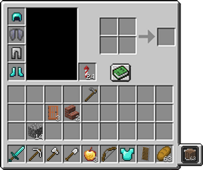
Finally, I strictly focused on questions about the inventory. I showed users a photo of the inventory for reference, and asked a few questions on a scale from 1 (Hate it) to 5 (Love it) about how enjoyable the UI is to use, how easy it is to quickly digest information, and how quickly they can find what they need using it.
Most respondents found the Minecraft inventory relatively easy to use due to its simplistic nature and simple UI layout. However, after a few updates, the inventory becomes very cluttered, especially with the sheer number of new items, weapons, and blocks. Some complained about how little inventory space there was, and how bundles and shulkers did nothing to help.


Most respondents had to rely on their own organization to figure out where everything was. Some claimed that the icons tended to blend into one another. Others mentioned that the hotbar was very useful, but others said that there are now too many tools and things they need to have in their hotbar that it renders the mechanic useless.
Game Analysis
After interviewing and surveying users, I did some market research with two questions in mind:
1. What were other games, similar to Minecraft, doing with their inventories?
2. What tools/functions did they have that could be applied to Minecraft's inventory?
With these questions in mind, I focused on survival and sandbox games. I looked at forums and Let's Plays to see what exactly players liked and disliked about each inventory.
Stardew Valley
The first game I looked at was Stardew Valley. The game has very limited inventory space, which can be expanded through backpack upgrades that you gain throughout gameplay. Similar to Minecraft, inventory management and item clutter are two major problems.
A few notable mechanics from the Stardew Valley inventory were the trash can, so you can easily dispose of unwanted junk in your inventory without having to pick it up again. The auto-sort feature allows you to add items to existing stacks when picking up from chests or other sources. And organize, which organizes your inventory by grouping items by type— tools, consumables, harvest, seeds, forage, etc.

Problems
After collecting the survey results and analyzing other games in the same genre, I identified three pain points that players had with the UI:
Inventory Clutter, Hotbar Clutter, and Difficult Inventory Management
Using the three identified pain points, I created a problem statement to guide brainstorming solutions.
Inventory Clutter
Even with a straightforward UI, players reported that when their inventory fills up, it also gets visually cluttered. They struggle to find items amid the sea of colors and icons, especially when many blocks can look the same at first glance.
Console players also noted that quick sorting is a grueling task because they have to click each stack out of chests individually.
Hotbar Clutter
With the addition of new tools and equipment, players reported struggling to keep their hotbar organized and useful. They often struggle to use the quick-select function efficiently because their hotbars are cluttered.
Some talked about how they get frustrated switching between tasks like building to combat, to mining, because they set up their hotbar differently for each.
Difficult Inventory Management
When deep in the mines or far from base, players reported that it’s irritating to dispose of unwanted items when their inventory fills up, especially when they auto-pick up items that they just disposed of on the floor. This problem gets exacerbated by the number of new blocks and items players can collect now in the game.
Problem Statement
Modify the inventory sorting functions so players who like to explore and build can enjoy their experience without their inventory becoming cluttered and difficult to organize.
Solutions
These are the four features I designed that will help combat the pain points and address the problem statement previously discussed:
Trash Can, Sort and Search, Autosort, and Hotbar Presets.
Trash Can
To address challenging inventory management, this feature gives the player an inventory trash can. Players can place an item in the trash can slot, and after a short time, the item will be deleted.
This helps players avoid the frustrating cycle of throwing items on the ground with the means to get rid of them, only to have them auto-picked back up.
Wireframe:
Trash Can
This wireframe showcases what the trash can would look like in-game. On the right-hand side of the inventory is the trash slot. When an item is placed into the slot, it will be deleted after 5 minutes. This is to prevent players from accidentally deleting something important without having a "Confirmation of Destructive Action" (CODA) message. Players can dispose of one stack of items at a time.
Sort and Search
To combat inventory clutter, this feature would organize items into the following categories: Building blocks, Consumables, Weapons/Armor, Mob drops, and Crafting materials.
This would be in an area attached to the inventory, similar to the tabs in The Long Dark.
When selecting a tab, it also highlights the items in the inventory to reduce visual clutter.

Wireframe:
Sort and Search
This wireframe shows the design prototype of the Sort and Search feature. If the player clicks the magnifying glass button next to the recipe book, they can access the sort window, where it will populate and organize itself based on items in the inventory.
The tabs consist of building blocks, consumables, weapons/armor, crafting materials, and mob drops. Once a tab is selected, items in that group will be highlighted in the inventory
Autosort
To combat inventory clutter, this feature is similar to the one found in Stardew Valley. When clicked, items will organize themselves in the inventory. If clicked while interacting with a chest UI, it will auto-stack items in and out of the chest.
This helps console players sort efficiently, rather than having to hover over every single object to sort them quickly. This also benefits players who don’t want to open the search/sort section, as it lets them promptly organize their inventory.
Wireframe:
Autosort
This wireframe depicts what the Autosort feature would look like in-game. On the right-hand side of the inventory is the organization button. When pressed, all items in the inventory, except those in the hotbar, are sorted based on item type. This inventory is sorted into building materials and then tools.

Hotbar Presets
To combat hotbar clutter, this feature would allow up to three hotbar presets for extra storage and let players save presets they can toggle based on different tasks.
If they are building, they can have a hotbar preset that has all their blocks ready. When they are in combat, they can have a hotbar preset with potions/food and one with weapons, so they can quickly switch between those.

Wireframe:
Hotbar Presets
This wireframe shows the design of the Hotbar Presets feature. At the bottom of the inventory, you'll find three hotbar presets that you can save and swap out at any time. You will be able to cycle through them quickly, so that you will have multiple hotbars at your disposal for different tasks/objectives.

Full Features Wireframe
This is what all the features, together, look like in one inventory. The big submenu, Sort and Search, can be toggled on and off as mentioned previously. This is to keep the UI less cluttered when all the features are present.
Reflection
This inventory redesign was especially enjoyable for me, having played Minecraft for most of my life, but that familiarity also became one of my biggest challenges. I struggled with how to meaningfully update a UI that is both deeply nostalgic and deceptively simple.
I worked through this by leaning heavily on user testing and interviews. I spoke with players who had never touched Minecraft to identify areas that felt unintuitive, and with long-time players to uncover smaller friction points they had simply learned to live with. That combination of perspectives guided my iterations and helped me balance respect for the original design with thoughtful improvements.